Pathways School Portals

Adapting to the future of learning

Overview

In 2020, COVID threw students into unfamiliar territory when it forced them to adopt a slew of online programs. Students of all ages would ultimately find themselves wasting time navigating through the complex network of programs. Our team at Pathways sought to redesign the experience in order to reclaim their time for what really mattered: learning.


The Challenge

How might create an online learning experience for all students of the Seattle Public School District without the frustration of wasting time in the current system?


The Solution

Pathways is an online portal that saves students time by providing all their learning needs in an all-in-one streamlined package. Based on research, user feedback, and testing, it is carefully crafted to meet the needs of the Seattle Public School System while addressing the problems of the current system.

Timeframe

10 Weeks | Sept 27th – Nov 23rd

Roles

Research, UX Design, UI Design, Prototyping, Testing

Skills

Research, Analysis, Wireframing, Storyboarding, Needs Diagram, Empathy Mapping, User Testing

Collaborators

Monica Ravitch

Participants

Cynthia L, Ethan P, Shadow Z, Ann, Zach P, Christina W, Thien Van T

Tools

Illustrator, Figma, Zoom, Miro

RESEARCH

Discovery

In order to get down to the source of what caused students to lose time, we had to research both the programs and the users. Seattle Public School District’s current solution for online learning requires the use of five different portals: Schoology, The Source, Office 365, Clever, and SeeSaw.
Schoology
Schoology Portal

Functions: calendar, classes, notifications, assignments, materials
Pain points: too many tabs, no consistency between teachers, lack of labels, hidden dropdown navigation

The Source
The Source Portal

Functions: grades, attendance, fees, performance, and advanced learning
Pain points: too many tabs, lack of hierarchy in importance, confusing organization of information

Clever
Clever Portal

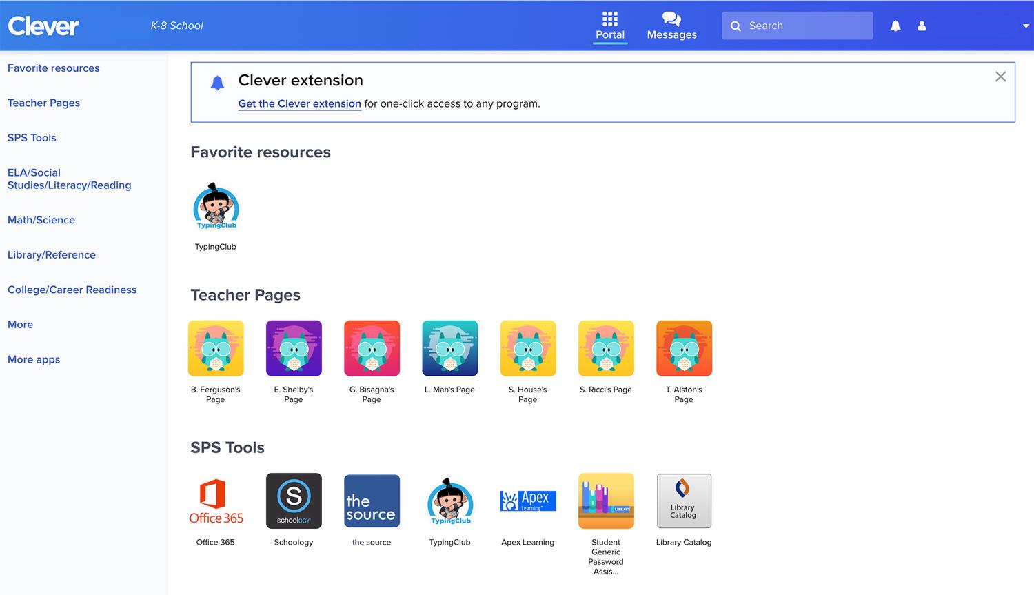
Functions: teacher pages, other tools, supplemental learning, messaging
Pain points: redundant functions, multiple logins, too many external portals, confusing navigation

Surveys

  • Parents and Students
  • Unnecessarily complex
  • Too much information spread out through too many portals
  • Hard to find what you need
  • Need help from others when they can’t find what they’re looking for

Interviews

  • Parents, Teachers, and students
  • Too many portals to keep track of
  • Difficult finding what you’re looking for
  • Always asking teachers for help
  • All teachers do things differently

Goals

Keep all the content contained in one program without the need for extra tabs or programs
“It is hard keeping track of all the programs because each teacher and class uses them differently”

–SPS Student
Built-in support for a more streamlined communication system to connect and manage messages
“I had at least 100 students trying to connect with… saying they didn't know how to use this or that.”

–SPS Teacher
Organize information with more recognizable design patterns so it’s easier to understand
“When my tech-savvy kids can’t figure out how to use the tool, it doesn’t make sense.”

–SPS Parent

Personas

“I don’t like sitting in front of the computer all day”
Aaron Persona

Aaron P

12 Years Old
6th Grade
Seattle, WA
Frustrations
  • Occasionally misses assignments because he can’t find due dates
  • Has to ask for help because doesn’t seem to get the how to use the programs
  • Has trouble remembering how to navigate to certain homework assignments
  • Has a hard time focusing for long periods of time

“It’s hard figuring out the best way to contact each teacher for help”
Raquel Persona

Raquel P

16 Years Old
10th Grade
Seattle, WA
Frustrations
  • Wants to know how she did on projects and tests
  • Always has to assist her brother with homework
  • Constantly contacts teachers for clarification
  • Spends too much time in front of the screen

Needs Diagram

Needs better organization, better communication, less clutter, and less portals
Needs Diagram

Empathy Map

Current system is frustrating, tiresome, difficult and takes up too much time
Empathy Map

Key Findings

Organize information: Create a To-Do List
Streamlined communications: Focus on Messaging and Forums
One program: Create Built-in Assignments

PROTOTYPES

Information 

Architecture

To build out the flows of our to-do list and assignments, we took research on existing portals and feedback from our users.
Information Architecture

Paper 

Prototype

Based on user feedback through paper mockups, we found a card and tab system was best for organizing information.
Paper Prototype

Lo-Fi 

Wireframes

Digitizing the mockups made testing easier. We found the design was not intuitive for the user due to a lack of information.
Lo-Fi Prototype

Mid-Fi 

Wireframes

Images, descriptions, icons, and color hierarchy was added to remedy any confusion from the previous mockup.
Mid-Fi Prototype

TESTING

User Flow

Check the to-do list and complete the assignment that's due.

User Testing

User 1

User 1 had trouble trying to navigate through our prototype and sought help to find certain connections


We created the right navigation to more prominently display the messaging for that type of user.

User 2

User 2 was more methodical and navigated by taking the time to read and analyze the connections.


We added more descriptions so that type of user could work their way around the navigations more quickly.

User 3

User 3 quickly clicked through links without reading until they reached their desired screen.


In order to save time for that type of user, we created multiple pathways to reach certain locations.

Brand

The name Pathways comes from all our different paths we take in our journey through school and life. The Logo represents a tree and the the various paths.
Moodboard

PATHWAYS

Screen Slideshow

Collapsing 

Navigation

Navigations can be collapsed down if the user is adept at using the program and need more workspace in the middle.
Gif of Collapsing Nav

Components / 

Tool Kit

We made a series of components and icons to create a cohesive look with easy to recognized patterns.
Components

Responsive 

for Mobile

The components are all responsive and can all be scaled down for different devices based on user needs.
Gif of Collapsing Nav

Color 

Themes

To make it more accessible for users, colors can be customized to the user’s needs with text, contrast, and font all following WCAG 2 standards.
Components

What Was Learned

Everyone has a process in which they work through a new UI. How much time we save for each type of user depends on the methods they use to process information and navigate through a new system. Getting the connections right takes lots of trial and error and what makes sense to the designer doesn’t always translate to the user.

What Could Be Improved

In every test we did, we found more and more insights into solving our problem. We could have done more testing on a broader age range to account for an even younger demographic to see their process. We also found that our navigation might overwhelm younger users. In future iterations, we can work to combine sections further to make them more digestible and save time.
Heyday Canned Cocktails
 Heyday Canned Cocktails

Read More

Touchpoints Ergonomics App
Touchpoints Ergonomics App 

Read More